Subscriber Exclusive
Coloring in a Fair Isle Tam
How do designers come up with fabulous color combinations? By breaking out the colored pencils!
How do designers come up with fabulous color combinations? By breaking out the colored pencils! <a href="https://farmfiberknits.com/coloring-in-a-fair-isle-tam-bring-your-colored-pencils-please/">Continue reading.</a>
https://farmfiberknits.com/cdn-cgi/image/format=auto/https://www.datocms-assets.com/101500/1707337460-img_1559_edited-version-final.jpg?auto=format&w=900
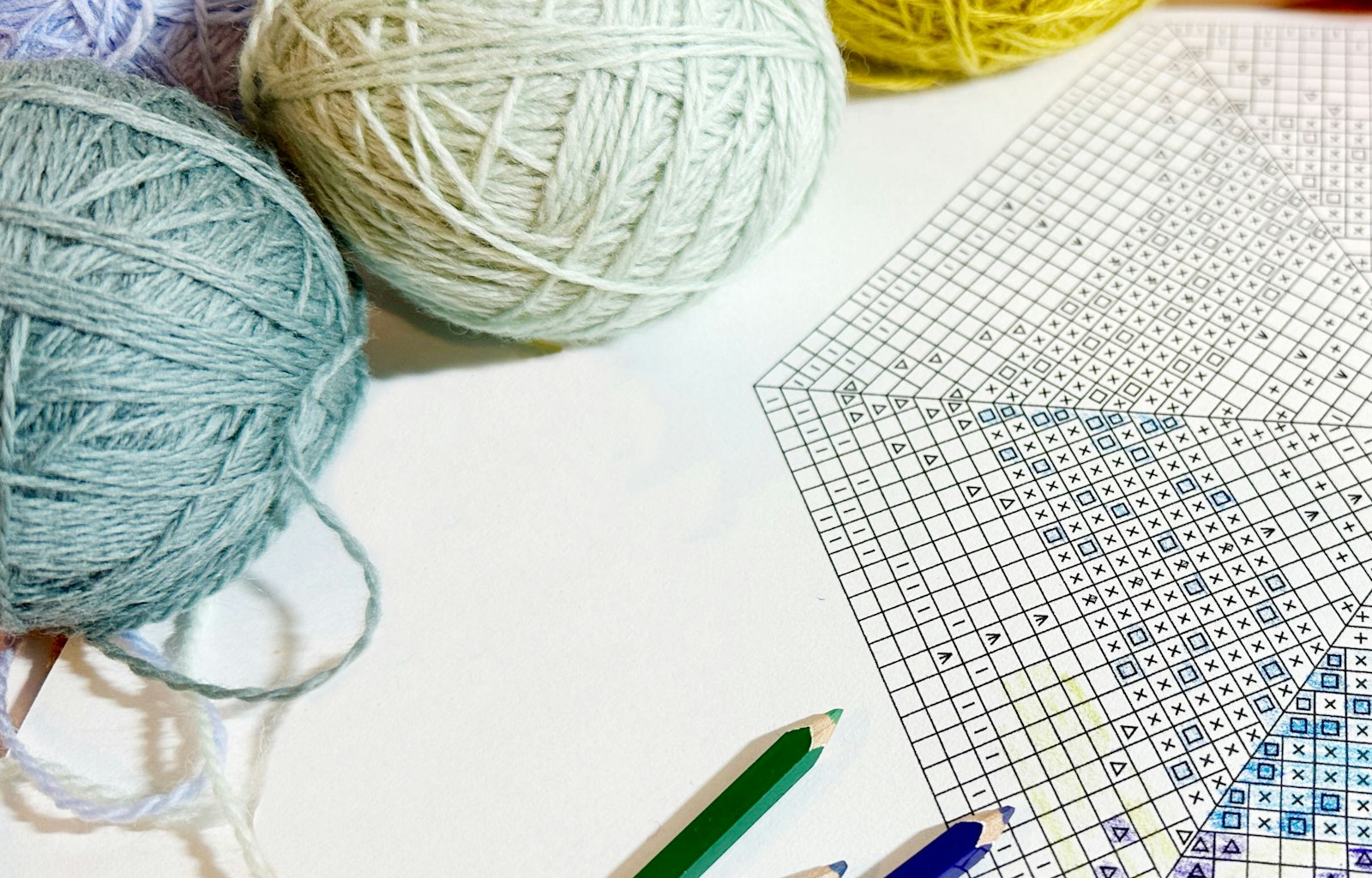
Pull out your colored pencils or crayons and test your Fair Isle pattern before swatching. Photo by Pat Olski
Stranded colorwork knitting offers one of the most fun experiences in the knitting world—watching your rounds of lovely stockinette stitches grow while seeing how the next color complements the last is really satisfying.
But selecting colors for your project can be daunting, because in order to be really successful, your yarn choices need to have enough contrast and an array of values (how light or dark a color appears), and sometimes hues (the actual color), to get the really rich effect that is the signature of Fair Isle stranded knitting.
Using color theory or playing with a color wheel are important strategies when planning a multicolor stranded knitting project, but sometimes hands-on experimentation is the best way to proceed.
Here are a few tips to get you started:
SUBSCRIBER EXCLUSIVE
Unlock the Full Article with a Farm & Fiber Knits Subscription
Get instant access to this article and the entire Farm & Fiber Knits library of projects, inspiration, and expert instruction. With your subscription, you'll receive:
Connect more deeply with your yarn—learn the stories of farmers, shepherds, and dyers
Knit patterns that celebrate natural fibers and slow, intentional making
Support a community of small farms, women makers, and independent yarn companies
Includes print and digital issues of Farm & Fiber Knits, delivered directly to you
With must-knit projects and unforgettable stories, Farm & Fiber Knits invites you to see the craft world through fresh eyes.
Plans start at just $5.83/month (paid annually). Cancel anytime.
Stranded colorwork knitting offers one of the most fun experiences in the knitting world—watching your rounds of lovely stockinette stitches grow while seeing how the next color complements the last is really satisfying.
But selecting colors for your project can be daunting, because in order to be really successful, your yarn choices need to have enough contrast and an array of values (how light or dark a color appears), and sometimes hues (the actual color), to get the really rich effect that is the signature of Fair Isle stranded knitting.
Using color theory or playing with a color wheel are important strategies when planning a multicolor stranded knitting project, but sometimes hands-on experimentation is the best way to proceed.
Here are a few tips to get you started:
[PAYWALL]
1. Place the colors of yarns that you like onto different backgrounds—hold them against pieces of dark and light color fabric or paper—to decide which effect you prefer. A light yellow against white may look gentle, against a light green may look saturated, and against black may look intense. Background colors are very important and are often overlooked.
2. Start out with a variety of lights and darks, but try to include at least one unexpected color to save your knit from dull color changes.
3. Contrast, contrast, contrast. Without enough contrast, your pattern may look muddy, or overly subtle. In doubt about the value of your yarns? Photograph them and view using the grayscale filter on your phone. A little fiddling with technology can save you from finding out halfway through your knitting that two colors appear the same when knitted next to each other.
4. Plan your stranding so you are not carrying long floats of your darkest color behind a light background. Perhaps that dark shade can be centered around rounds of medium-color wool.
Paint-by-Number, Knitting Edition
If you’re deciding on color placement for a stranded colorwork project or wondering which hue to use, match your yarn choices to colored pencils and get sketching. (This can also be a helpful approach if the chart shows the original colors and you’re knitting a different palette. It is easier to color the chart than to remember that red equals blue and yellow equals black for the whole project.)
These downloadable pattern graphs were designed by our project editor, Angela Schneider, to help you make your yarn color choices, and also as a nice treat for those of us who wonder things like, “What would it look like if I changed the background to green?” Pull out those colored pencils and play. It is so nice to so how the colors will interact with each other in a visual format. (And besides, coloring is such a pleasure.)
Download the chart from the library: Charts to Color: The Tam O’Shanter
Pat Olski is a designer, author, and the editor of PieceWork magazine.

