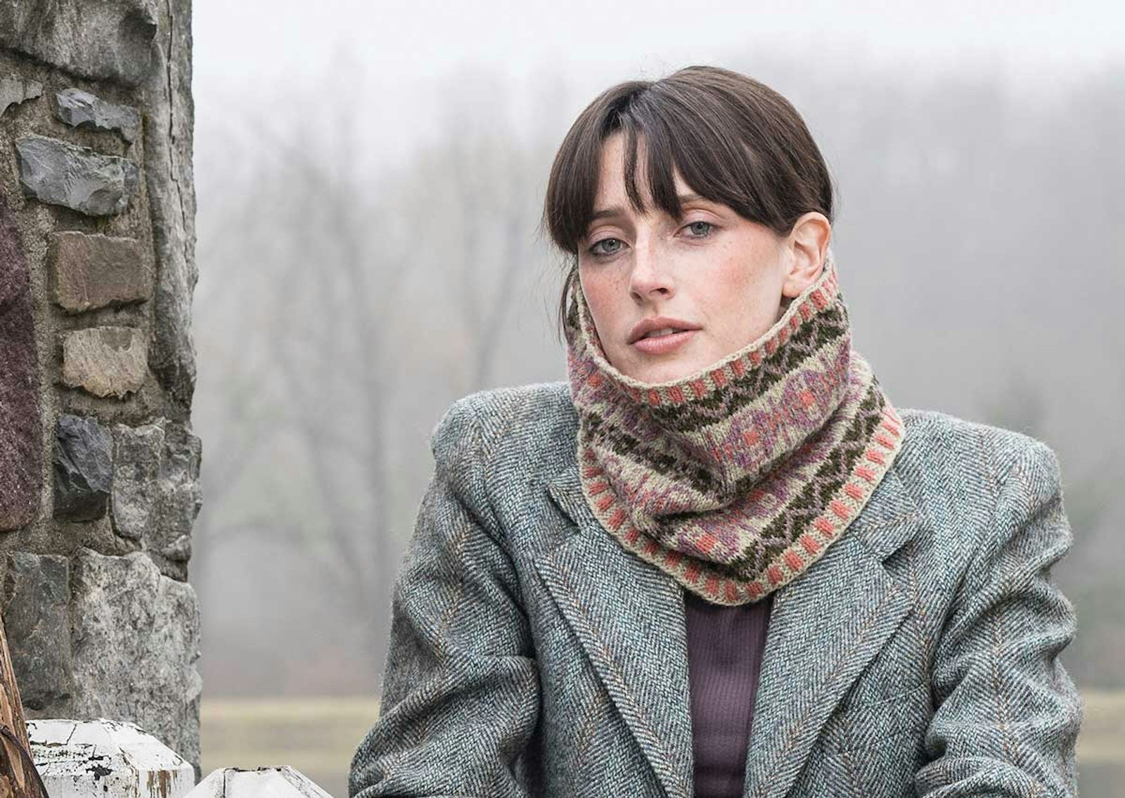
Inspiration for knitwear design comes from a variety of sources. Most often, other interests (not related to knitting) or the environment plays a part in where ideas come from. For Gudrun Johnston, the land of her upbringing provided the colors for her Identity Cowl that she designed for the premier issue of Farm & Fiber Knits magazine. She was inspired to incorporate the earthy and pastel colors of her childhood home on the Shetland Islands—soft grays and purples framed by a peaty black—into her colorwork design. In reading her article “A Wooly Walk in Shetland,” I began to wonder what I would consider to be the colors of home.
I’ve lived in northern Colorado for the past 30 years, where I attended college and raised a family. As such, the blues, browns, and greens in this part of the state would be an obvious choice to reflect my idea of home. However, when I think of my childhood and home where I grew up, my thoughts go back to what’s known as Colorado’s Western Slope. I grew up at the base of the Colorado National Monument, with its stunning rock formations, desert temperatures, and dry climate. How might I translate this landscape into my knitting?
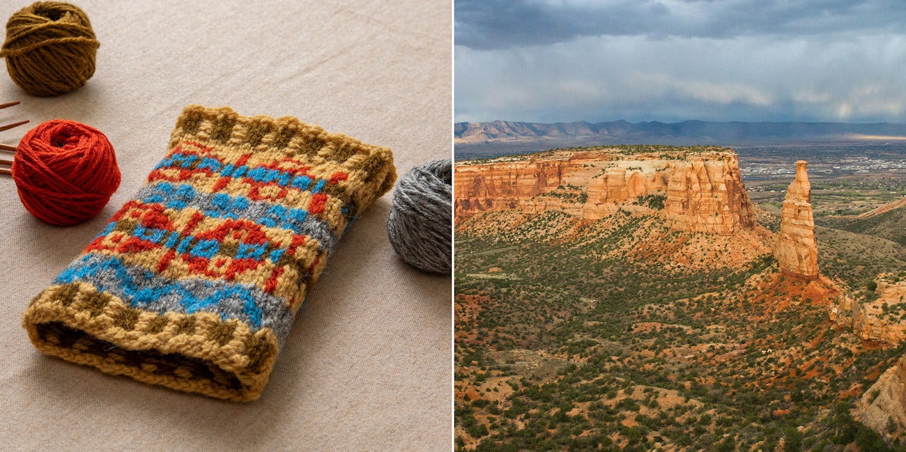 Left: Katrina switches up the colors in the Identity Cowl to match her childhood home; photo by Matt Graves. Right: The Colorado National Monument on Colorado’s Western Slope provides Katrina with color inspiration; photo by Holly Mandarich via Unsplash
Step 1: Find Your Color Story
Choosing new colors for a color-stranded project can be daunting, but starting with a source of inspiration can make it a lot of fun. After I found a suitable photo of the landscape surrounding my childhood home, I used an online color palette generator to zero in on the colors of the landscape and sky.
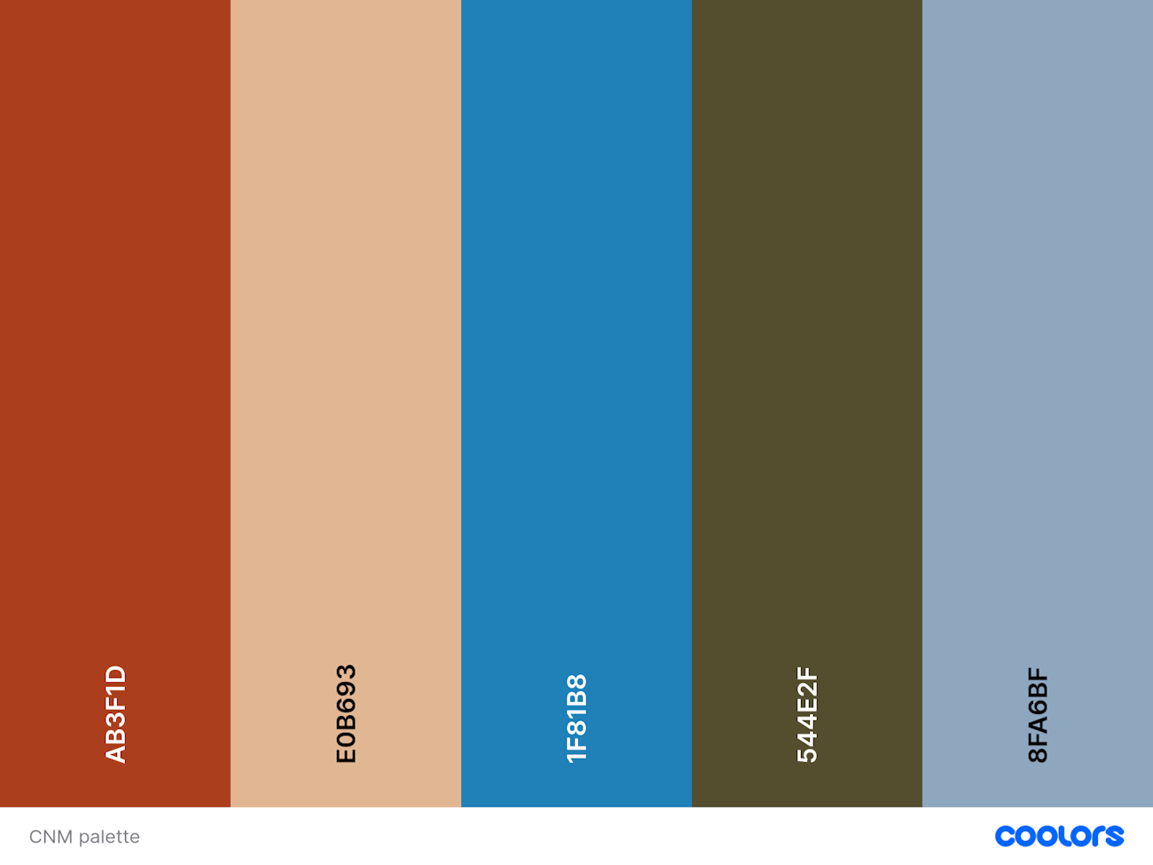 Five colors generated by the Coolors free color palette generator from the Colorado National Monument photo.
Once I had my inspiration palette, I needed to translate these colors into yarn for color stranding. I needed to select five colors from the many available in Jamieson’s of Shetland Double Knitting yarn—the same yarn Gudrun used. Since the gray and blue were representative of the colors of the sky, I wanted to use them together for the smaller pattern bands. However, while I liked both of these colors in the palette, they seemed too close in value for the two areas to really pop in the design. So I chose a lighter gray to make the blue stand out better, just as it does in the photo. I also selected an orange and gold that reflected more of the heat of the desert.
How would my choice of colors affect the feel of the pattern? How would the Identity Cowl worked in a vibrant palette contrast with Gudrun’s softer colors? Casting on is the best way to find out.
Step 2: Assign Colors and Cast On
I already knew I wanted blue and gray in the small patterns. I wanted the gold to be a dominant color, so it would form the background of the main motif. Then, orange and brown were a natural fit. This is just my first round of guessing colors and placement. Most knitters do several iterations before settling on all the details.
For this small swatch, I just jumped right in, but many knitters find it helpful to print a black-and-white copy of the pattern chart and use colored pencils to fill in the recolored design. You could also use a spreadsheet app to create a digital chart with your new colors.
Since the charts each use a different number of stitches in their repeats, I chose a stitch count that would give me full repeats of the larger charts. I didn’t worry that the smaller motif charts weren’t complete.
Working a small tube in the round allowed me to test the colors, while also creating a swatch that is worked in all right-side rounds like the cowl pattern. After blocking, this should provide an accurate gauge to ensure I have enough yarn and don’t need to make any additional changes.
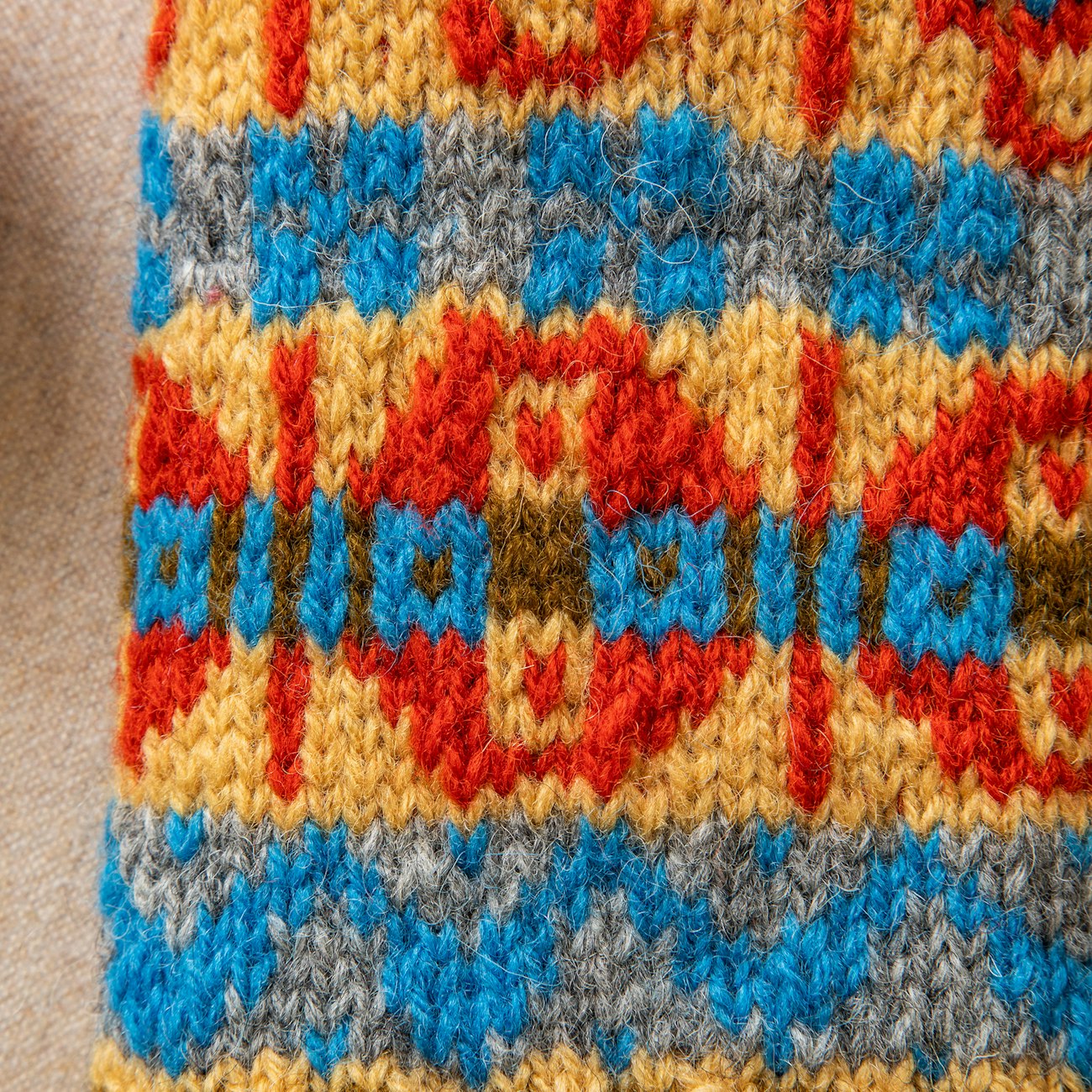 Katrina’s random swatching produced another hallmark of home in the stitch design. It’s a Palisade peach! Photo by Matt Graves
Step 3: Ponder the Results
As I stepped back and looked at the design, I realized that by using orange for the round portion in one of the charts, another hallmark of my home stands out to me—a motif that looks like Palisade peaches! The brown could have leaned a bit more toward green, but I like how it works with the orange and gold yarns. In fact, there is plenty of contrast in the main-motif colors that allows each of them to stand out in the pattern.
One trick to test for color contrast is to use a black-and-white digital filter. Looking at the swatch this way helps me see that I need a softer gray for the sky if I want the blue motifs to pop.
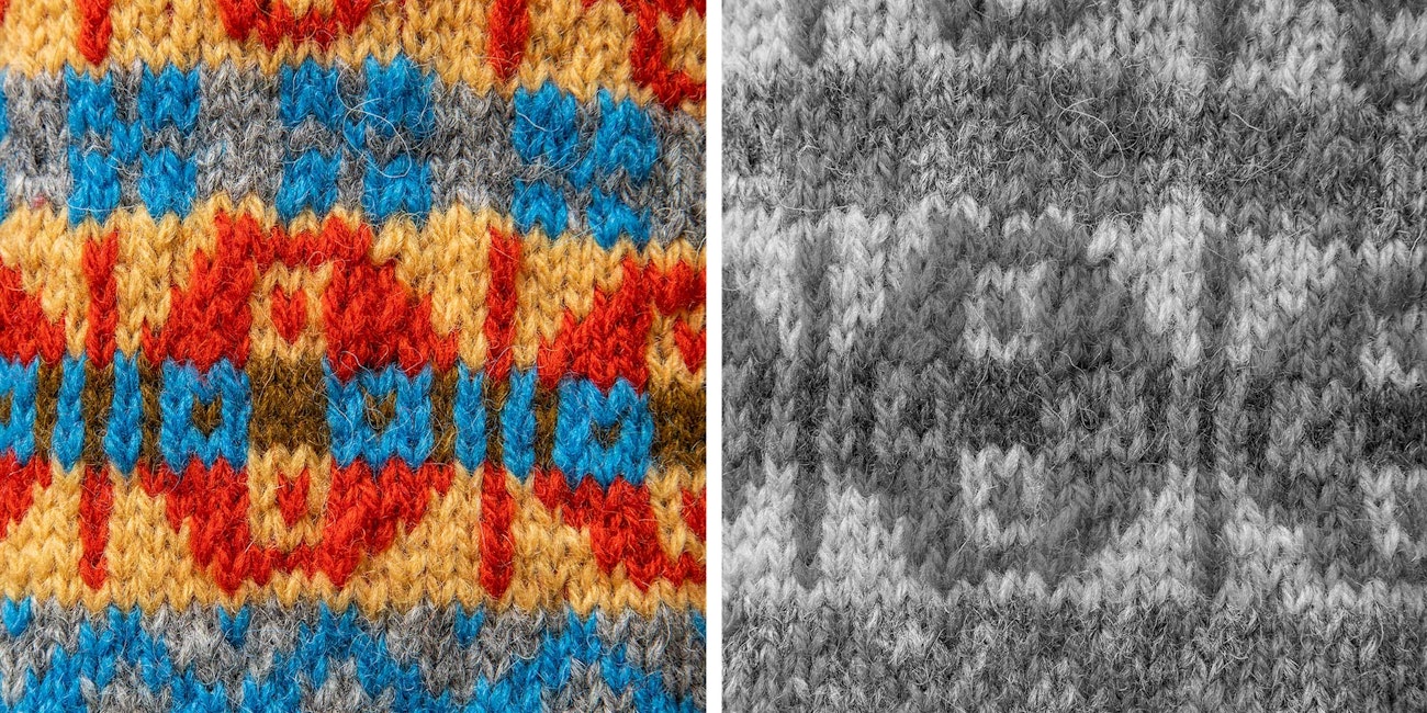 Using a black-and-white digital filter can help you see contrast. Photos by Matt Graves
My swatch shows me that I may need to go back to the drawing board with this particular palette. Another thing my blocked swatch shows me is that I need to remember to switch back to smaller needles to work the ribbing and bind-off. My swatch flares at the bind-off edge, and now I know how to adjust when working on my actual project.
—Katrina
Pro Tips!
- Starting with an inspiring photo is a great way to get going, but you can make adjustments as you work. Add colors, change colors, drop colors—there are no rules.
- Placing colors within the design is one of the hardest parts. Just moving or changing one color can have dramatic results.
- A small tube swatch can be steeked. This is a great way to quickly knit a swatch in the round and get more comfortable with cutting your knitting.
- Don’t worry if your first swatch isn’t perfect. Every swatch you create will teach you more about color.
Interested in creating your own unique Identity Cowl? Find Gudrun’s story and pattern in the premier issue of Farm & Fiber Knits and share your personalized color palettes with us.
Subscribers can also access the pattern for the Identity Cowl in the Farm & Fiber Knits Library. Download PDF

