
My first experience working on a color palette for yarn was back in the late 1980s when I had some input on Tahki’s Donegal Tweed line—a large range of gorgeous, speckled tweeds. Over the years, I was able to apply my instincts for color to several more yarn lines, and in 2016 I began consulting with June Cashmere. This small company was just beginning to produce Kyrgyz cashmere handknitting yarn for the American and European markets. Part of my brief there was to develop a limited color palette that would appeal to handknitters. The base yarn is unbleached cashmere, which has a tannish cast, giving the dyed yarn a muted look. When I became involved, June Cashmere was already offering the yarn in two weights and four classic shades—natural, red, navy blue, and slate gray—and they wanted to increase that to a palette of 12 colors.
After months of brainstorming, many dyed samples, and final decision-making, we had a balanced 12-color palette.
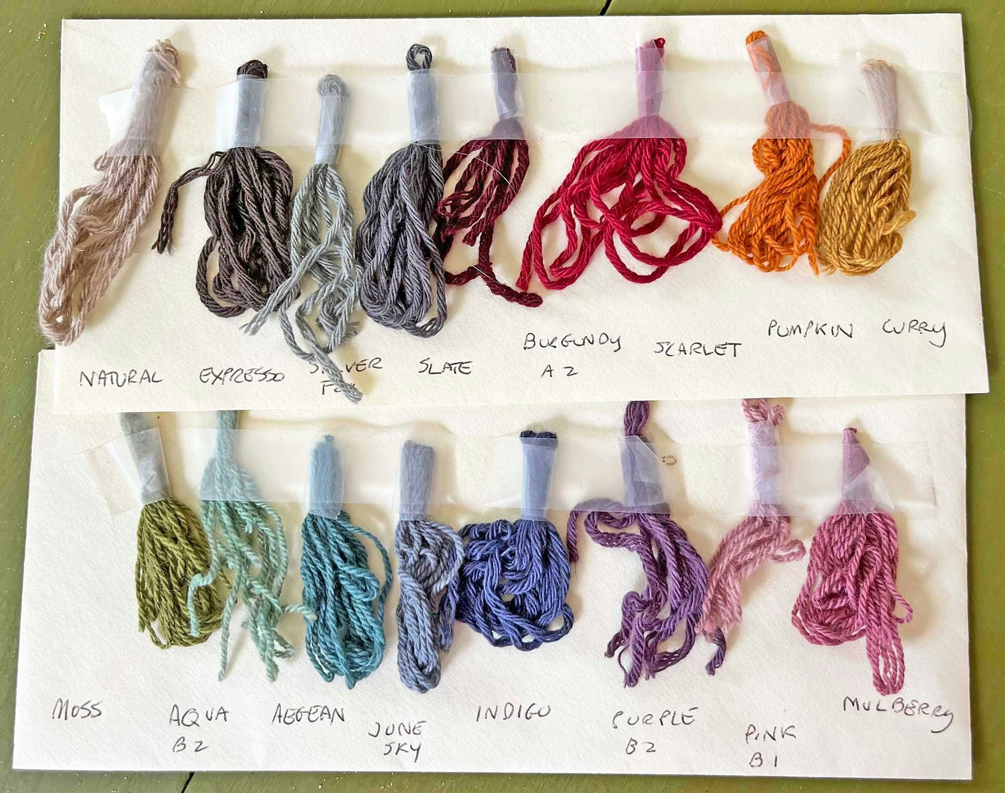
 This original color card shows the palette of 12 yarn colors that the author helped develop. Photo by Karin Strom
There are many factors go into building a yarn color range:
• The finished palette should look good together on a color card, web page, or yarn shop shelf.
• It should reflect the feel and vibe of the company and stand out from other similar brands’ color ranges.
• Because knitters will be using the yarn mainly for clothing and accessories, the colors should be flattering to a range of skin tones.
• There should be enough contrasting colors to provide options for colorwork.
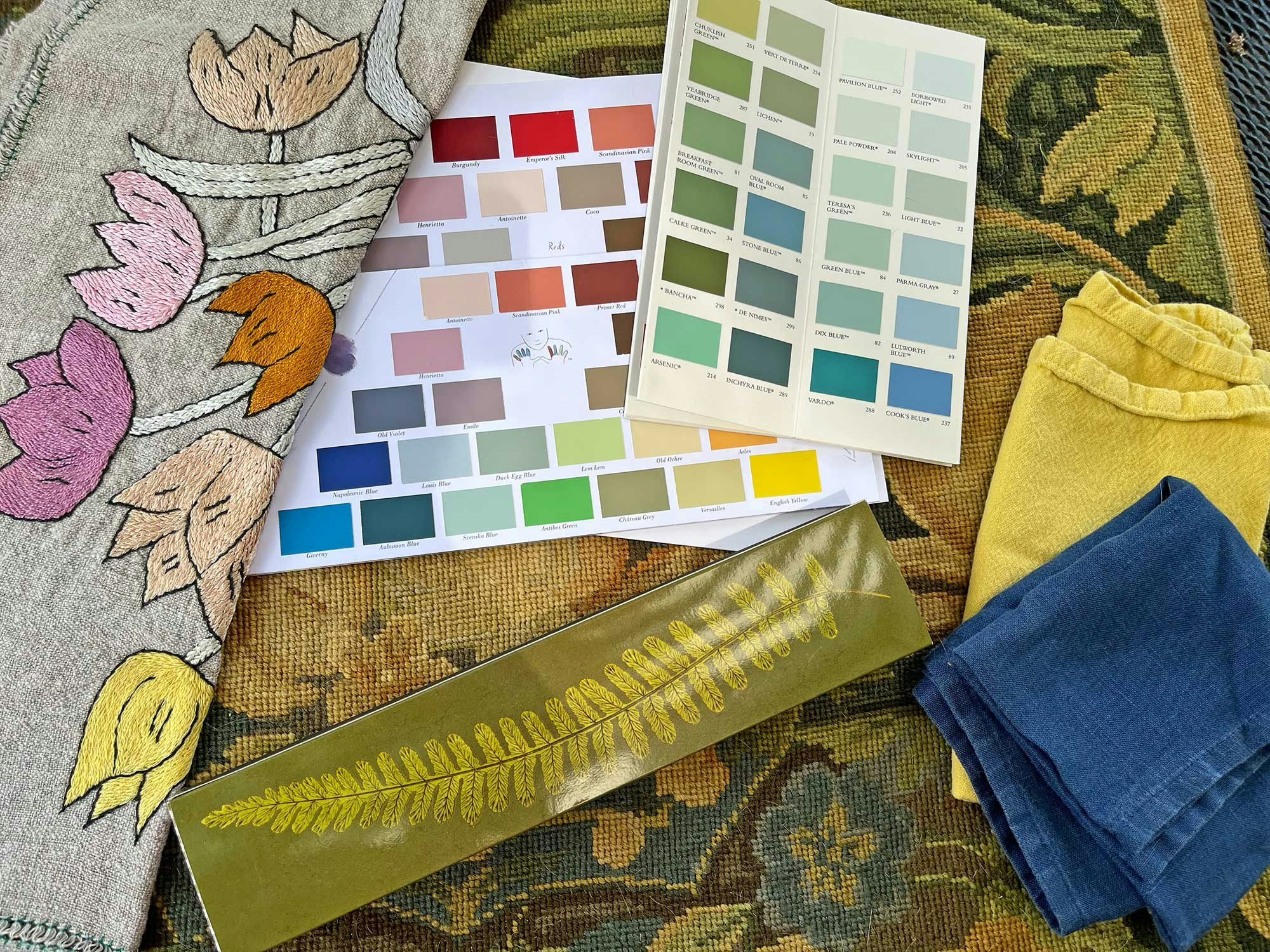
 In order to develop a palette that reflects the nature and terrain of Kyrgyzstan, Karin developed a mood board that included photos of the flora, landscape, and textiles that she saw throughout the region. Photos by Karin Strom
From Mood Board to Skeins in Hand
Ironically, it’s almost easier to come up with a large range of colors then a limited one. Even if a yarn company isn’t focused on being fashion forward, there are color trends that become a part of the zeitgeist of the moment (hello, pumpkin!). Because June Cashmere yarn is completely natural 100% cashmere and not highly processed, we wanted to offer a palette that reflected nature, specifically the unique terrain of Kyrgyzstan. So I looked to botanically dyed Kyrgyz textiles for inspiration as well as photos of the Kyrgyz landscape, flowers, and vegetation.
Get a closer look! Click any image in the gallery below to open it in full-screen mode.
The actual color development process involves many steps and a lot of back and forth with the dyehouse. The first step is building a mood board of the inspiration and a cohesive palette that evokes that mood. Next is finding reference swatches to send the dyer. These could be anything from paint chips to bits of fabric. The dyer does lab dips and sends them back for review (typically two or three versions of the new shade are sent). Often, there is another round before the final colors are reviewed. Finally, it’s time to make color cards and photograph the yarn colors for the website—matching actual yarn to what appears on the computer screen can be a challenge in itself! (June Cashmere offers customers individual sample reels of current dye lots to assure color accuracy.) The entire process can take up to nine months.
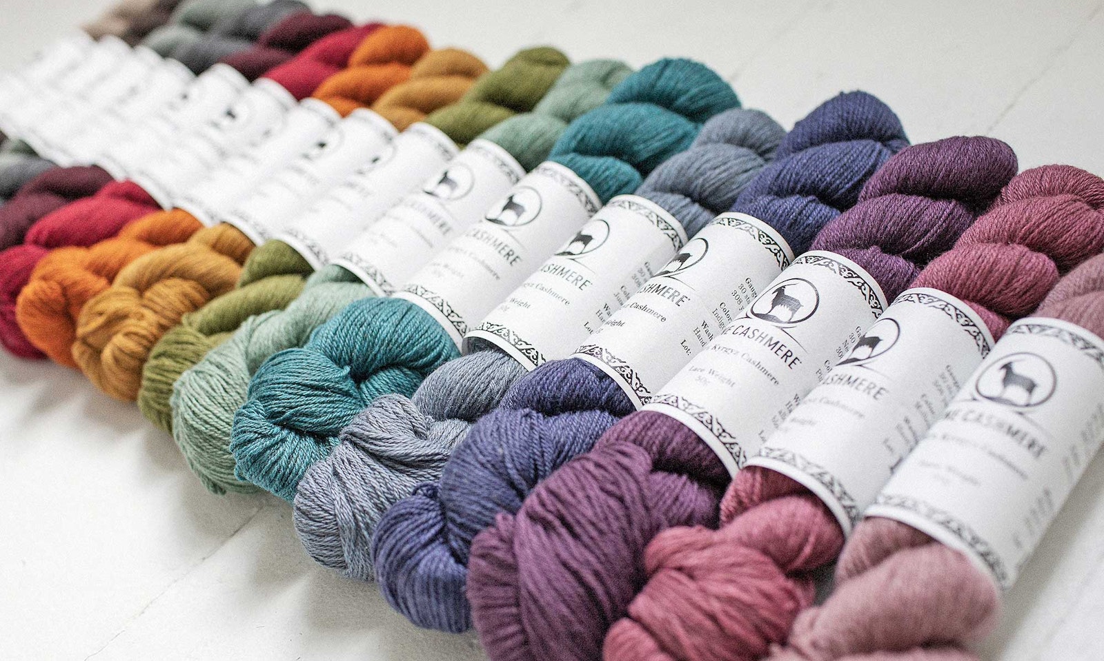
 June Cashmere's latest color card consists of 16 colors.
June Cashmere’s US Director of Operations Amy Swanson added four new colors to the range and is planning a few more. “When considering new colors,” she says, “I look to see what colors complement the existing palette and think about what our customer will like.” Reds and blues are perennial favorites. “But I must admit, some colors happen because they are colors I am drawn to and want to develop, like our recently added Marine, a classic rich blue that’s brighter than our Indigo.” With an eye toward colorwork, she has added a lighter pink (Stonecrop) and a lighter teal (Sea Glass). “I was looking for colors with a difference in value,” Amy explains.
 Jewel tones and earth tones in DK weight.
But How Will It Look on Me?
There are many factors in the psychology of color, but for knitters, practicality plays a big role. “Although a knitter may really like dark shades, they might have a difficult time seeing the stitches on their needles,” Amy points out. “And wearability is important.” You may love that pumpkin orange but not want an entire sweater of it. “When I’m at a show or event, the color a sample garment is knit in absolutely influences the choices customers make,” she adds. “Knitters invariably want to make the garment in the color that’s displayed. On the other hand, though, it always surprises me when a color I don’t expect ends up being a bestseller at a particular event, and who knows what makes that happen? Could be anything—demographics, lighting, even the location of the event!”
 Left: The Turmok: A Swirl Yoke Sweater, by Norah Gaughan. Right: Morgan Vest in fingering cashmere, by Tayler Harris.
Fortunately, the color range I helped develop for June Cashmere has proven to be a solid foundation to which they’ve added as the company evolves. The muted colors and the deep tones of the June palette highlight the beautiful stitch definition of the cashmere yarn and the line of classic patterns they offer.
See June Cashmere’s line of beautiful yarns and learn more at JuneCashmere.com.
And read “Cashmere From the Silk Road” to learn about Karin’s trip to Kyrgyzstan, find out how June Cashmere began, and discover how it continues to connect you to local communities in Kyrgyzstan.